Perkaus & Farley LLC project
(2021-present)
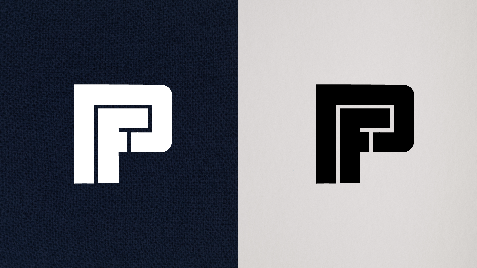
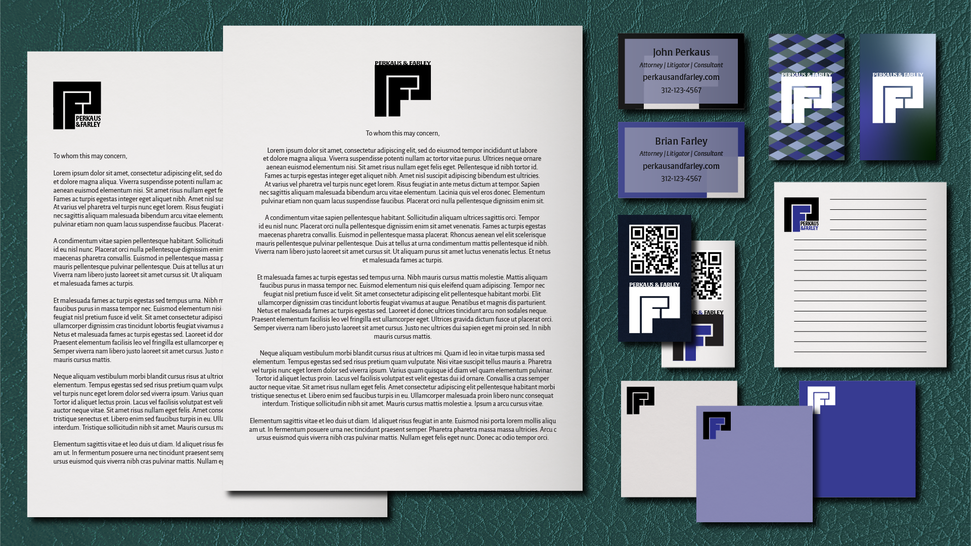
I was approached to do the Perkaus & Farley site redesign in 2021. The brand needed honing and clarification, and the site was very barebones, so we initially had a clean slate. Sticking with the original black and blue but imagining a cleaner, sleeker logo and branding to make them look like a top Chicago firm to match their reputation and reviews.
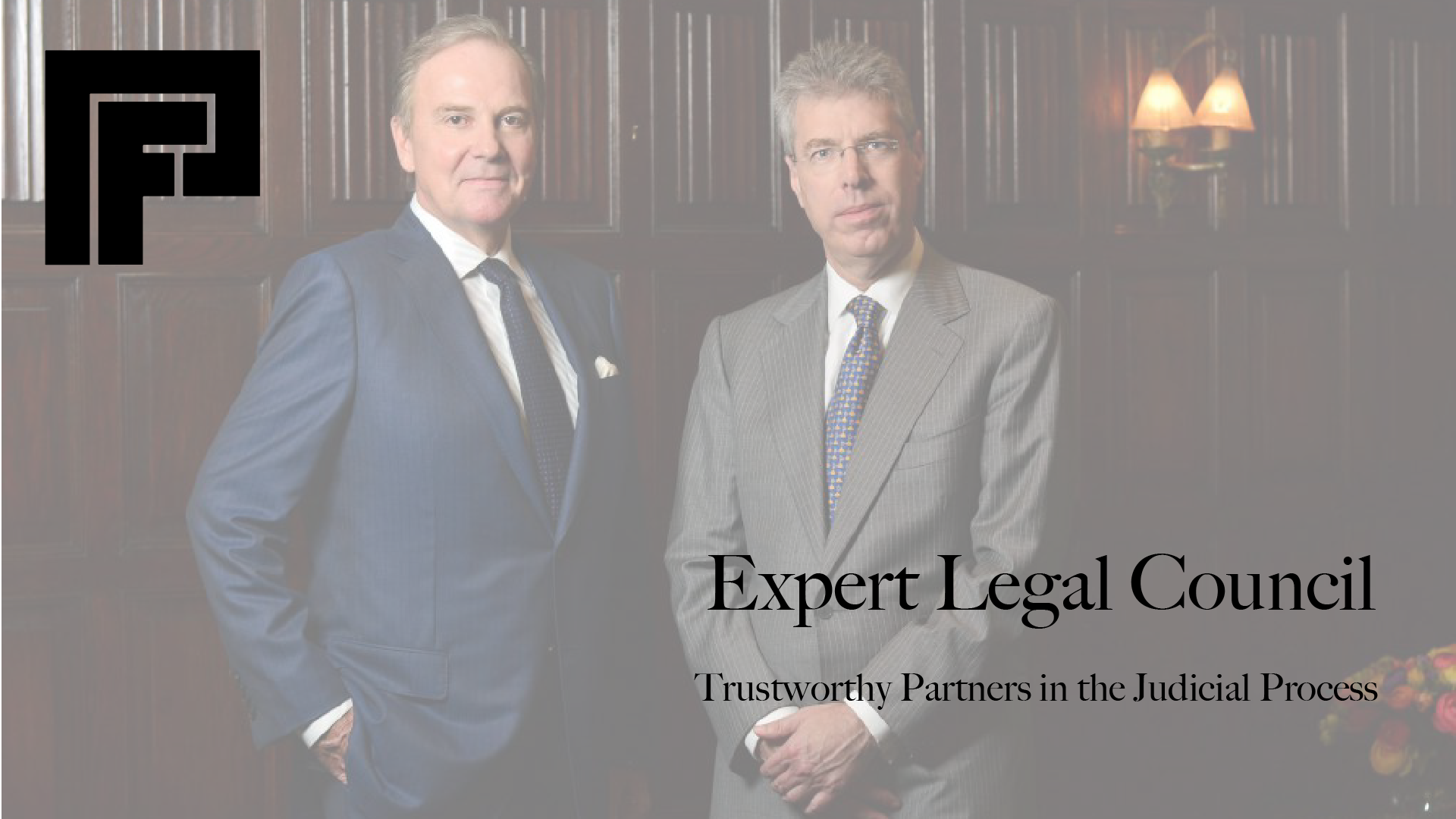
I curated images from both the legal field and Chicago’s ample beauty to create a strong look and localized touch. Blue also symbolizes trustworthiness, an essential aspect of any good firm’s brand. This garners trust from new and existing clients, and provides valuable resources for those in local communities. On the forefront of modern legal council, you need a professional site with visual appeal, and this provides exactly that. I continued working with Perkaus & Farley until 2023 and still consult on projects as needed.